It was brilliant to receive feed back on the work I had been creating and I came to a few realisations on what work actually was successful and which pieces I juts thought were successful.
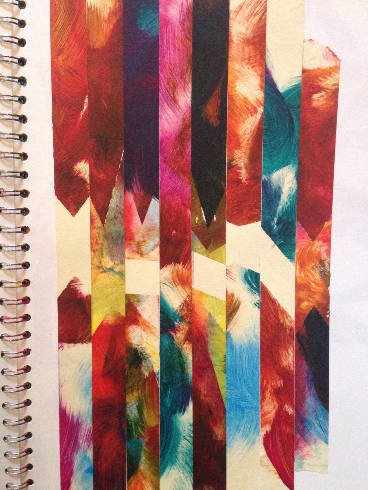
After creating a variety of work using text, computer imagery and different techniques in painting, my masking tape drawings had shown to have become the most successful. What I found strange about this is how I had discontinued using masking tape as a way of working very early on in the course and moved away from it, only to now find it is the main thing I am concentrating on. What stood out to the tutors was how the indecision in mark making and what colours I had chosen gave the piece energy and movement. Another aspect of the work was how when the colours were placed next to the purity of the white the became much more vivid and noticeable. This had quite an interesting effect because due to the amount of white in the work it was surprising to see how the white didn't overwhelm and consume the work.


I had created one piece on three canvases that didn't represent any of the good points about the masking tape paintings. I had tried to stick and create a formula to create work and this had an incredibly negative effect when it came to the end product of the work. The piece lacked any kind of movement and it looked too forced. What makes my other pieces work was the look of a preconceived idea mixed with chance and spontaneity.
After the Viva my idea's progressed further in the way that I wanted to have an intentional meaning as well as holding a high importance in the process of creating the work. I felt with previous pieces that had been unsuccessful I had made them too even, too polite. So this is the area I had to change. I began trying to make the pieces deliberately problematic to the eye by creating a sense of unease and off balance. After experimenting more with this idea I felt increasing the scale would increase the direct interaction with the viewer. This would make it unavoidable to become baffled on whether the piece worked or not.
I began making a 5ft by 7ft canvas. Making the canvas bigger than a person was intentional to again try and carry off the overwhelming feel of unease.
Building the stretcher and stretching the canvas was fairly straight forward, however it was time consuming and when it came to priming the canvas it took 4 layers of primer and sanding to get the intended effect. I had to make sure the canvas was as white and smooth as possible so the white could highlight the surrounding colours as much as possible.
I began to question if it was worth it. Because preparing the canvas ready to paint on was taking 3 times longer than it was going to take me to tape it up and paint it. I spoke to my tutor about this who made me understand the preparation for the work is a vital part of the process and part of the work itself. For example the majority of the time Damien Hirst's work relies on the preparation and planning before putting the work together.
Masking the piece was relatively simple. It was just a challenge to envision what the end piece was going to look like because of the scale of the canvas. It was also very difficult when choosing how thick to have the masking tape lines. Too thin and the piece would become too intricate and complicated. Too thick and the piece would become too disjointed which is an effect I have yet to decide if I like or not.
When it came to painting the canvas the scale became problematic again. This was because on the smaller scales it was quite easy to keep up the energy and aggression while painting. This took a lot more effort to put forward to same movement throughout the piece. It was also challenging when applying the paint, as on a small scale several blobs of paint would suffice to fill the whole page, whereas on the large scale it took much more thought when placing the paint down onto the canvas. (Mainly to try to prevent much wastage.)
Once I'd finished the piece it was clear the scale had helped the effect the work had dramatically. Because of the scale the painting became much more a statement, something that could not be ignored. It became apparent as well at this point how effective the hand made canvas was. The choice to prime it as many layers as I did created a much more clean cut finish than if I'd just gone a bought one. It was also good to see how my choice not to prime the edges of the canvas became part of the work too. I did this as I knew when painting the shapes I would not paint up to the edge of the canvas anyway. Therefore when looking at the side of the canvas you can see a decent into purity. This also clearly shows another process within the piece. Overall I thought the piece had worked well, however in future I need to try and be less vigorous when applying the paint. This was because I did rip some of the masking tape off which meant paint bleed into the white space. This did add a feeling of imperfection to the work. It is up for the viewer to decide whether that is a positive outcome or not.