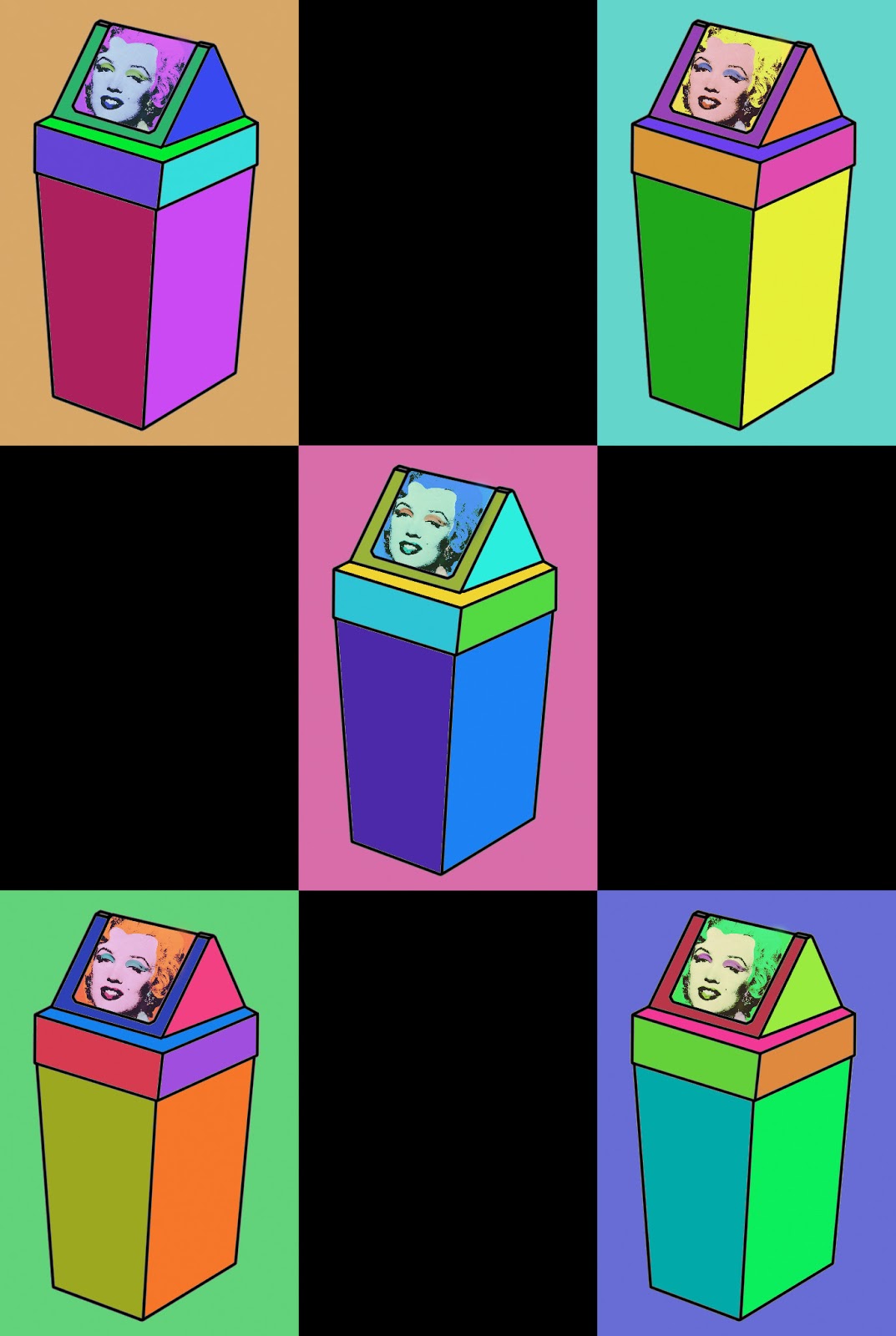
What influenced my decision for these pieces was the induction into photoshop and computer art. I wanted to combine my previous use of geometric shapes, pattern and colour. I was a bit lost at first until I began drawing what was in front of me which happened to be a bin. I drew it out free hand before outlining it with a pen and ruler. The drawing itself was constructed from different panels and it interested me to see what the result would be if I filled these panels in with a variety of high key colours.


This turned out to be quite an effective result so I played on the idea of repetition taken from Andy Warhol. I then started to include Warhol’s work in mine by taking his Monroe piece and placing it in one of the panels. I took inspiration from the postmodern movement in the sense of re-using/recycling found imagery. These Pieces created a different effect in comparison to the normal bins, however I am unsure on whether it is a positive or negative effect so I can only conclude that it is different.


After becoming more confident using photoshop I started using an architectural space (for example a hallway) as the subject. These pieces were my favorite and in my opinion the most effective. This is because the combination of colours held an obvious contrast but related in a positive way throughout the piece. I also began to alter the space itself by de-cluttering/removing things from the composition, making it very clear and clean cut. I also changed areas such as the tiles in the kitchen to a classic black on white combination behind a grey microwave. I chose these colours as everyone can relate to them and are familiar to the area they are seen in. Also when changing the colour of the entire piece these colours stayed the same and consistent. I made sure of this so no matter what different colour combinations I had, each piece related to the previous.


I then thought of ways to expand on this technique and make it more challenging. I did this by adding a figure into the composition. I feel as a space it works well and the figure related better with the surrounding space than I expected. However I disliked the curtains in the background and parts of the figure as they weren’t created using straight lines, meaning the consistency of quality of line was broken down. Although this piece included more decision making when choosing what to keep in and cut out of the photo to give the best effect when it came to drawing it out.


I chose to use the hallway picture as my final piece, as I found it the most effective overall. I also chose to present three of the same piece varying in size and format. This was because I wanted to still use the idea of repetition in my work, however I didn’t want to go down the conventional route of displaying the same picture in different colours as I felt it lacked the innovation I was trying to achieve. When it came to printing I had to get advice from an outside professional, who told me to go away and re-draw the hallway so that it could be put to any size without pixelating. This took forever as I increased the canvas size to 10 by 12 meters and photoshop found it difficult to function with a file of this size. I am glad I redrew the hallway as I think I did a better job the second time around and there were less mistakes along the way.

No comments:
Post a Comment